Real estate website design
Roles
UX Researcher
UX Designer
Developer
Timeline
3 weeks
Ideate
Prototype
Test
Introduction
Overview
As the project lead, I was responsible for the full website redesign and launch of cakesandhomes.com, a real estate company based in St. Louis County specializing in Section 8 housing management.
Cakes and Homes needed a digital presence that could clearly reflect its mission, earn investor trust, and elevate its credibility in a competitive and often skeptical market.
With no prior site in place, this was a high-impact, ground-up initiative.
My Role
I led the end-to-end process, from stakeholder interviews and competitive analysis to UX design and development handoff. This included:
-
Conducting user and stakeholder research
-
Defining the site’s content strategy and structure
-
Designing a responsive, trust-centered interface
-
Ensuring handoff-ready assets for development
Project Goals
-
Clarify the mission: Communicate Cakes and Homes’ purpose and values with clarity and empathy
-
Build investor confidence: Establish visual and verbal trust through thoughtful design choices
-
Enhance brand credibility: Create a cohesive digital presence that reflects professionalism and care
Research
Market Insights
Through external research, I learned that real estate investors value:
-
Transparency in operations and financials
-
Clear, jargon-free communication
-
A strong and consistent brand presence
They are typically discouraged by:
-
Inconsistent messaging or visual clutter
-
Unclear value propositions
-
Poorly designed or outdated websites
This told me the product wasn’t just the homes, it was the company’s credibility.
User Interviews:
To dig deeper, I interviewed two existing investors who had previously partnered with Cakes and Homes.
My goal wasn’t just to gather opinions; I wanted to understand their emotional drivers, investment motivations, and what signals trust in this high-stakes domain.
I structured the interviews around three focus areas:
-
Investment decision-making
-
Trust-building signals
-
The role of the website in that process
Sample Interview Questions
What was happening in your life or business when you decided to invest?
What signals or content help you feel confident that a property business is trustworthy?
What specific questions do you expect a rental property business’s website to answer immediately?
(Full interview guide available upon request)
Affinity Diagram:
I used an affinity diagram to cluster insights by patterns in trust signals, red flags, and emotional cues that investors repeatedly referenced.

Empathy Map:
I created empathy maps to visualize the mindset of an investor: their fears, goals, questions, and what helps them feel secure.
These frameworks helped me move beyond assumptions and design a site that speaks directly to what investors care about most and not just what the company wants to say.

Archetype:
The Value-Driven Investor
The Value-Driven Investor is a community-focused individual, typically in their 40s or older, who prioritizes long-term financial stability and ethical investments. They seek to support businesses that align with their values and to secure their family's future through informed investment decisions.

Design
Design Goals:
The design was shaped by insights gathered from investors and stakeholders. My goals were to:
-
Communicate the company’s mission and clearly articulate the investor benefit
-
Establish trust and transparency for both tenants and investors
-
Express a unique brand identity that felt human, not corporate
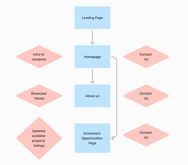
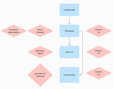
User flow design:
I began with a user flow to clarify what users needed to see, feel, and do on each page.
Initially, the idea was to include direct action portals for investment sign-ups. But after collaborating with the leadership team, we identified a stronger priority: emphasizing personal connection over automation.
So instead of pushing users into transactional flows, I simplified the contact form to act more like a “raised hand” and an invitation for real conversation, not a cold funnel.
Key changes based on this insight:
-
Moved Investment Opportunities to the homepage for immediate visibility
-
Added a customizable privacy policy section at the team’s request
-
Created a flow that reflected warmth, trust, and accessibility
Web elements:
Next, I sketched out all core content and components needed across the site, guided directly by user insights.
One quote in particular stood out:
“I’m more likely to trust a company that shows they care about their tenants.”
This shaped much of the content and structure. I made sure to:
-
Embed core values and social responsibility messaging throughout
-
Highlight tenant well-being, not just property metrics
-
Create a tone that balanced professionalism with empathy

Wireframing & Iteration: A Fast, Fluid Process
Because of the tight timeline and evolving team feedback, I adopted a fluid, additive workflow.
Instead of treating wireframes as locked blueprints, I wireframed, tested, and refined directly in the design files.
This allowed for:
-
Rapid experimentation and visual validation
-
Near-daily stakeholder check-ins
-
Continuous refinement based on live feedback
The result is a site that reflects not just the business goals, but the real people behind them.
Design Principles
These guiding ideas helped shape both the visuals and the experience:
-
Clarity over clutter. Everything from layout to typography was chosen to reduce cognitive load and make key information easy to digest at a glance.
-
Trust through consistency. I used repeatable patterns, consistent color use, and predictable interactions to reinforce professionalism and reliability.
-
Empathy as strategy. From tone of voice to imagery, every decision was rooted in building connection and conveying care, especially toward tenants.
Lo-fi wireframes

Impact and results
The redesign of CakesandHomes.com resulted in significant improvements in both user engagement and business outcomes.
What We Set Out to Do
-
Increase investor trust and inquiries
-
Make the company’s mission more visible
-
Improve overall user experience and time-on-site
Key Outcomes (within 3 months of launch)
-
73% increase in site traffic, driven by improved SEO and clearer messaging
-
2.4× more time spent on site compared to the previous version
-
40% increase in investor inquiries via the contact form
-
Reduction in bounce rate by 32%, suggesting stronger relevance and flow
Client Feedback
“We’ve been getting more serious inquiries in the past month than we did in the entire previous quarter. The new site feels like we have a face to present proudly in the world"
— Cakes and Homes Co-Founder
The project not only met the client’s original goals, it also gave them a scalable platform for future growth and partnership development.
I highly recommend checking out the live site at cakesandhomes.com to experience the final product for yourself.

Key Learnings
In design school, I was taught not to treat your design like your baby. To not become so attached that you lose your objectivity. I used to think that only applied to designers. But this project showed me that attachment runs deep across roles, especially in leadership.
There were moments when a team member in an executive position was deeply committed to a particular idea, even when it conflicted with user needs or research. I realized my role wasn’t just to offer solutions, it was to advocate for them with clarity and confidence.
When my suggestions were overlooked, I learned not to take it personally, but to improve how I communicate value and influence decisions more effectively.
This experience strengthened not just my design instincts, but my ability to navigate pushback, guide compromise, and stay grounded in the "why" behind the work.
I also learned how to stay flexible when things move fast. Sometimes you have to shift direction quickly, but still keep the core user goals in focus. That balance is something I’ll take with me into every future project.

